This law firm wanted a new look that felt saavy and up-to-date, legal but not overly lawerly. They wanted to shift away from the aesthetics and imagery often associated with law firms.
After working with a designer on 99designs to create a new brand identity, they wanted to impart their new brand onto a simple website that highlights their practice areas and provided potential clients a method for getting in touch.
Starting Point
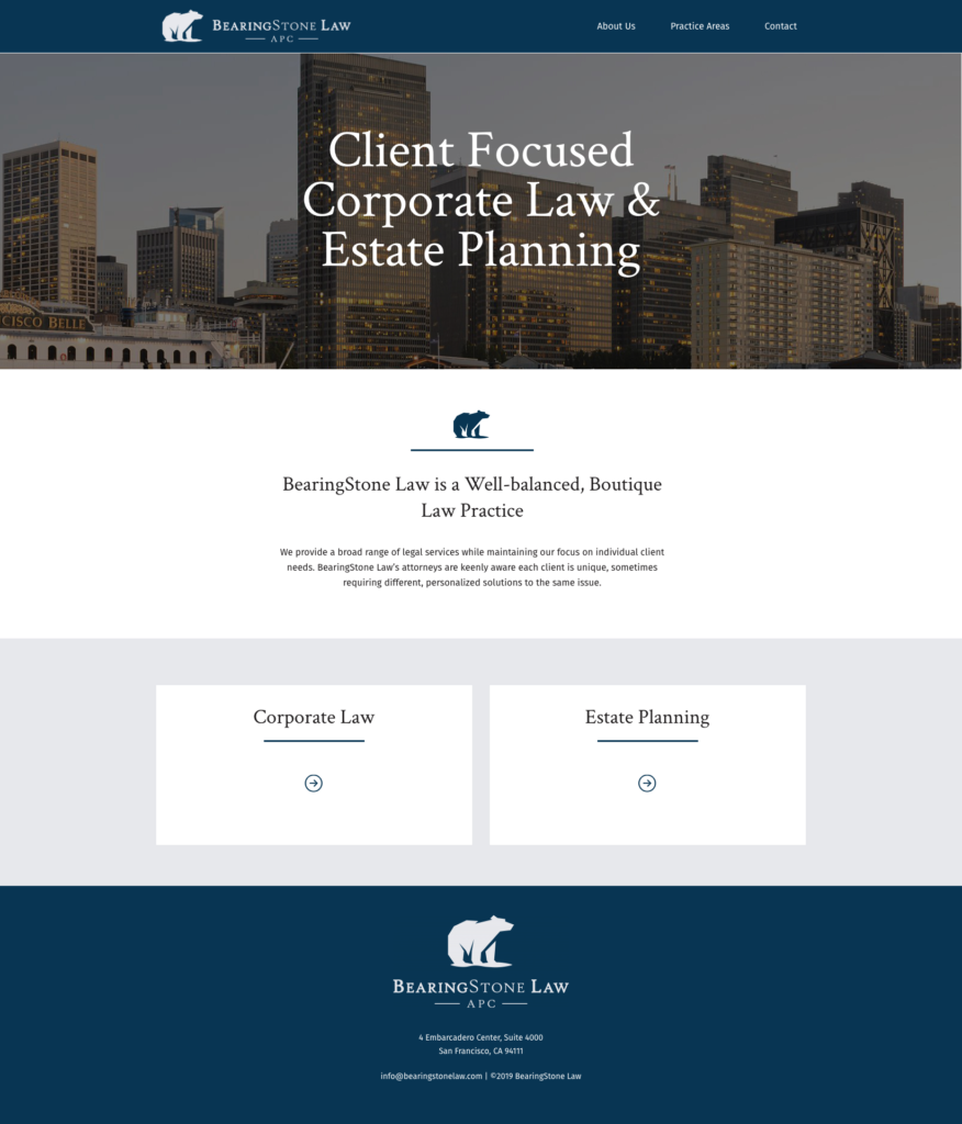
Here is a starting point, designed by another web designer. I felt that this was too templately, too “out-of-the box”.

For me, the hero area felt like dead space, and failed to emphasize the “client focused” aspect of the law firm’s services. The introductory “About” text didn’t do a great job at breaking up the information and highlighting the details that clients might actually be interested in.
Additionally, the user has to scroll all the way down to get a sense of what this law firm specializes in. Not to mention that the buckets took up unnecessary real estate.
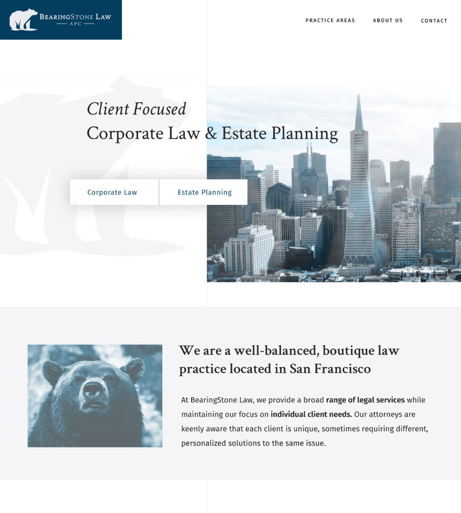
In my design, I wanted to convey that this law firm is in touch with the times and bring up quick access to their practice areas “above the fold.” I also wanted to express their brand direction in the aesthetic of images being used on the site. Mixing both images of downtown San Francisco (an expression of practice area: Corporate & Estate) with images that echo the bear in their brand.
She Speaks in Code Re-design

What do you think?